“Bridging the information gap from aspirational to UX Designer”
MY RESPONSIBILITIES
UX Designer
Visual Designer
Project Manager
KEY OUTCOMES
Working prototype for initial user testing
Foundation for a Minimum Viable Product
Validated a need for the product
Overview:
For the UX student trying to transition, get in or grow in the field of UX Design. Goal is a web app where students can find and search for resources by topic, validated the quality and apply to their learnings. As an UX student or aspiring UX Designer, I want to find and validate UX resources, so that they can learn more about UX with the goal of becoming a UX Designer.
Challenge:
Give a UX Design student an interface to locate, vet, and read or interact with validated UX Design Resources to further their UX Design learning and career. Students should be able to search for resources by topic, validate the credential or quality of the resource, and apply their learnings to their career goals.
“How might we bring the most relevant UX resources to one hub, as to close the information gap for students entering the UX Design Community?”
Users Audience:
For the UX student trying to transition, get in or grow in the field of UX Design. Goals is a web app where students can find and search for resources by topic, validated the quality and apply to their learnings.
How might we build a solution to solve this problem?
Processes + What I Did:
Working with the ACC Visual Communication Department they wanted to create a solution for budding UX designers. They were in class. Want to be a designer. Keep up with trends/latest info but with over 376 million results for UX Design. It is tough to weed through the noise. I was tasked with a producing a solution to help close the information gap. After talking with the stakeholders I read through the research that had already been gathered from student surveys. Being in the the Visual Communication department I also started to talking with current students and recent grads to better understand what they were doing currently to get this job done.
Personas + Empathy Map
From this I was then able to establish two distinct personas. Those with some design experience and those new to the design community. From the personas I wanted to really immerse myself into the user, so I used an Empathy Map to better help but myself if their shoes. After some user feedback and solid understanding of the pain points, struggles that students were experiencing. Seeing I was just in their shoes a previously, I took to the interwebs to see what was out there to help solve this problems.
Ideation Sketches
Now I had enough info to start ideating possible solutions.
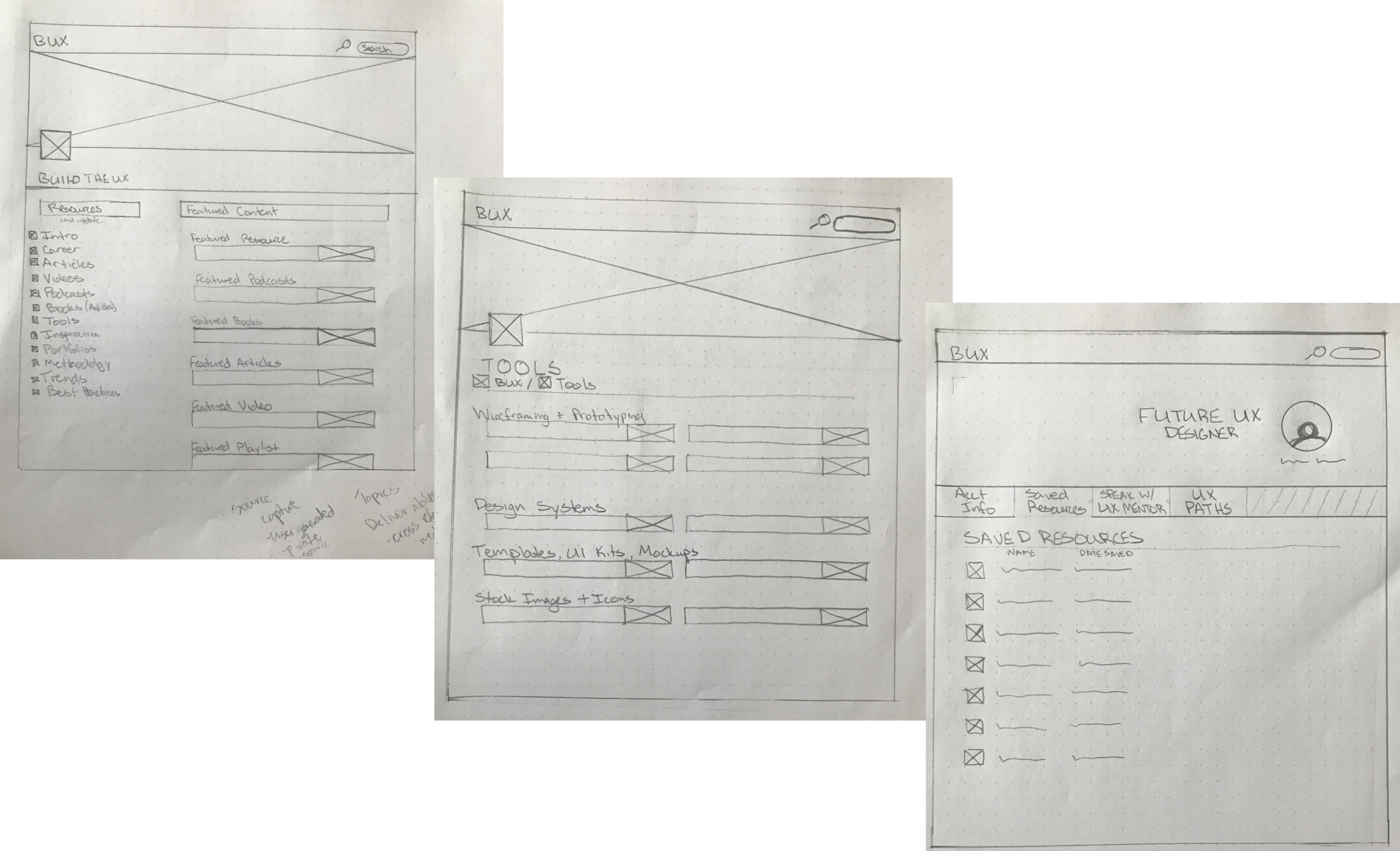
Paper + Digital Wireframes
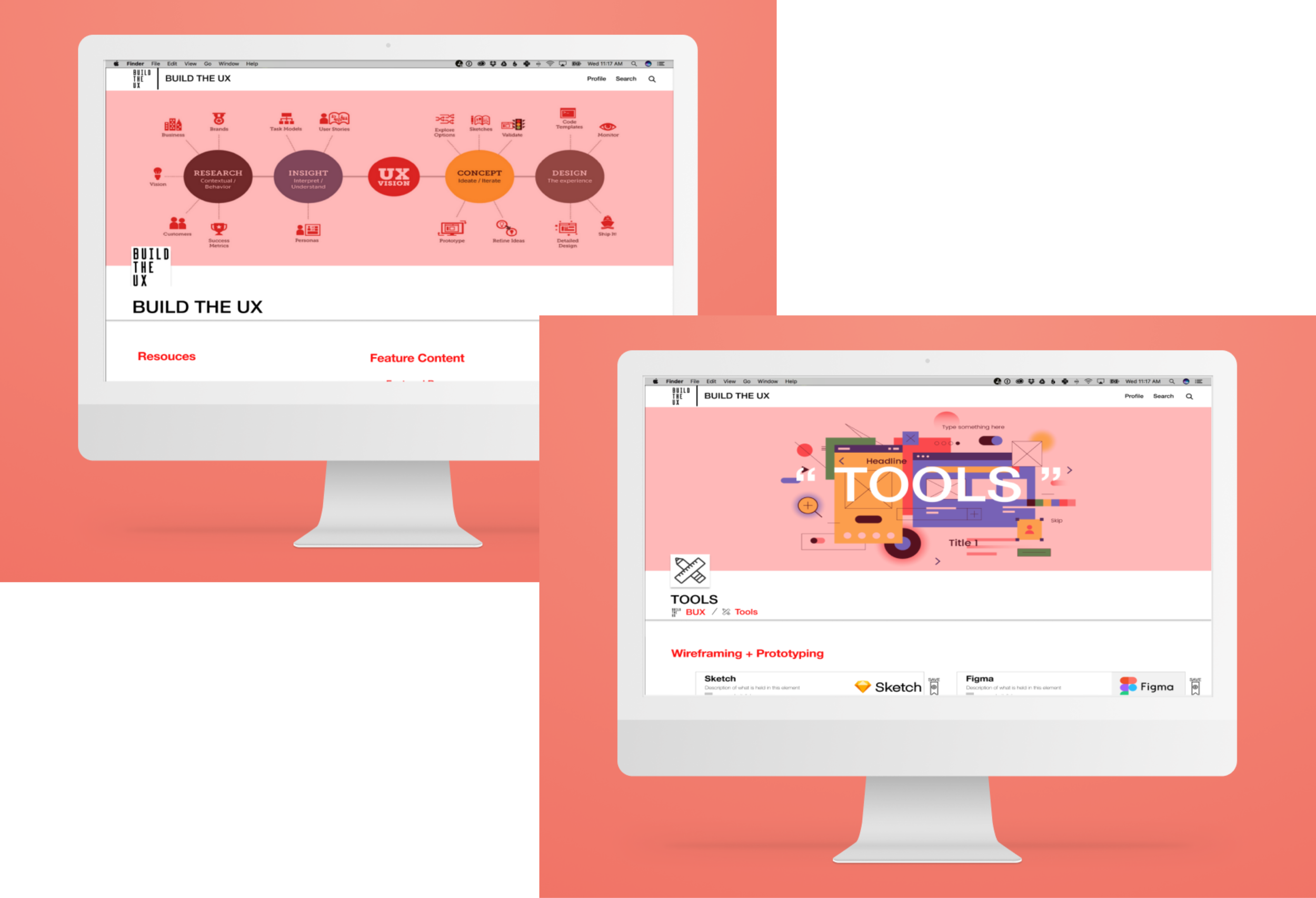
After some feedback I was able to whittle down my options to a paper prototype which went straight into some user testing via paper wireframes. Once we felt on the right track, jumped right into some mid-fi wireframes. After another green light from the team, I jumped into the visual design to get a first glance at some high fidelity screens.
Outcomes + Learnings
We were able to come out of the sprint with a working prototype that is currently being tested with users.
A key finding is that there is certainly a need and ACC would be ahead of the curve if they were to build out this solution.
Though we identified a problem and proposed a solution, there are some hurdles that would need to be honed in on. The major question, is how do we determine which sources are used to pull resources from? How do we validate within the department? Also a information architecture needs to be solidified, which can help with narrowing the resources needed. And lastly, is how would this site be maintained? How would we determine the product a success?


